University of Providence - A case study - The Wendt Agency

Case Study

University of Providence

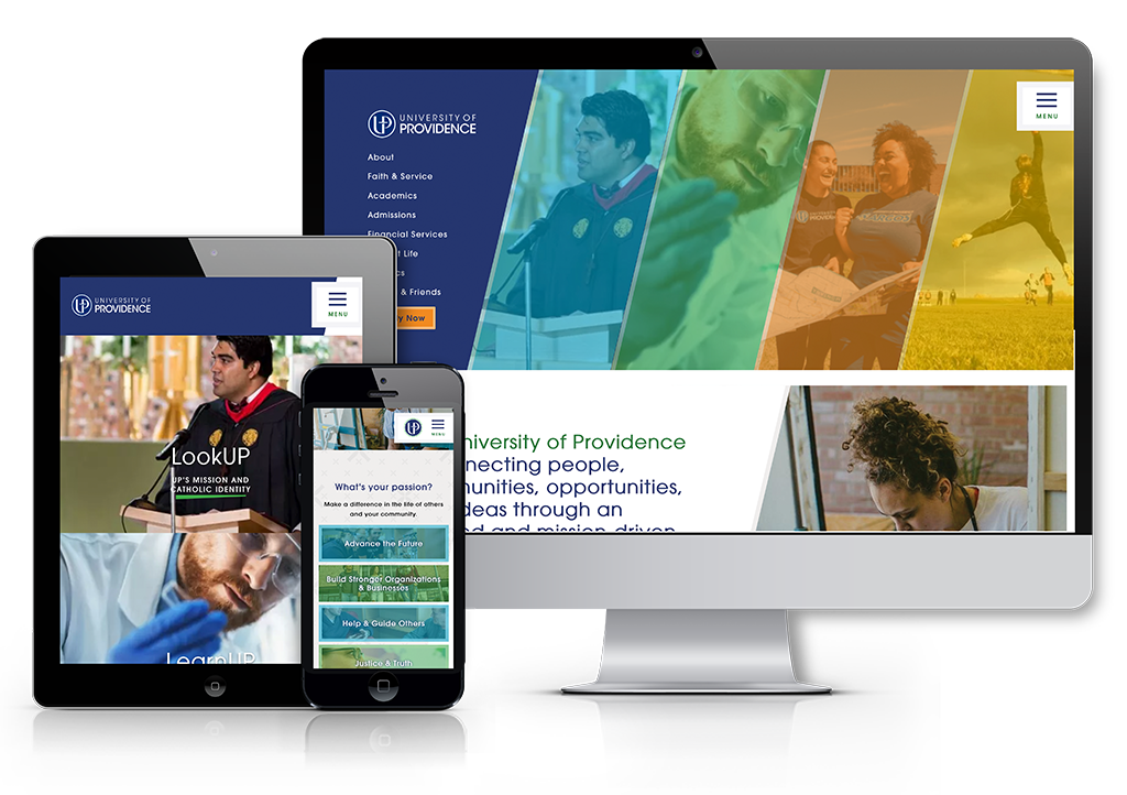
After walking through a branding process with University of Providence, we used the insights gained to create a new narrative for UP and translated that into their most powerful marketing tool; a new website. We worked very closely with UP to define a content strategy that would provide a better user experience for all the website user groups. There were multiple areas of improvement from the previous UP website that we addressed in the new site design which included navigation improvements, hierarchy of content and site goals, simplified page structure, and a responsive environment so the site was optimized for all devices. Another focus of the new site design was to better tell the story of UP and to create an authentic representation of the university. We worked with UP to create purposeful and compelling content that evokes emotion, has strong calls to action, and a consistent voice. 

improvements

The first step in the website process was an audit and analysis of their existing site. During this audit phase, there were multiple opportunities for improvement that were identified and addressed with the new site.

Issue #1

Too many navigation options.

Solution

Simplified navigation and strong visual hierarchy.

Issue #2

It was easy for users to get lost on the previous site.

SOLUTION

Sticky navigation, breadcrumbs, and following site’s folder structure.

Issue #3

Challenging mobile experience.

Solution

Responsive environment.

Issue #4

Lack of clear definition of user types and customized content for each.

Solution

Define user types and roles, and understand how they will use the site. Create purposeful and compelling content that better tells UP’s story. Evoke an emotion and have strong calls to action.

Like most university sites, UP also had a variety of external tools that needed to integrate seamlessly with the main site. Accessibility, simple navigation, and a nice, clean design were priorities going into this project.

Marketing Expertise for your Inbox

Marketing motivation and Wendt shenanigans worthy of a subscription.